Using Polytrends for Trading Analysis
The entire premise upon which Polytrends was designed, requires two assumptions:
- Price moves in trends, where current trends can be influenced by the past
- Price evolution can be forecast using past prices (contradicting the random-walk hypothesis).
What this really means: IF we can logically and systematically define trend, we can track each trend separately, THEN we can also logically and systematically track their corresponding significant levels of support/resistance.
Why is this Possible?
The short answer: I have no idea.
The answer from observation: Over the past 15+ years, I have noticed that price tends to behave in a certain pattern. Trends form and important levels can be derived from said trends.
Understanding the Trend
Above everything else, I believe this is the most important aspect of technical analysis, and this is the basis of how the Polytrends Algo works.
How it works.
- It defines trends.
- It tracks/plots those trends.
- It draws their corresponding levels of significance.
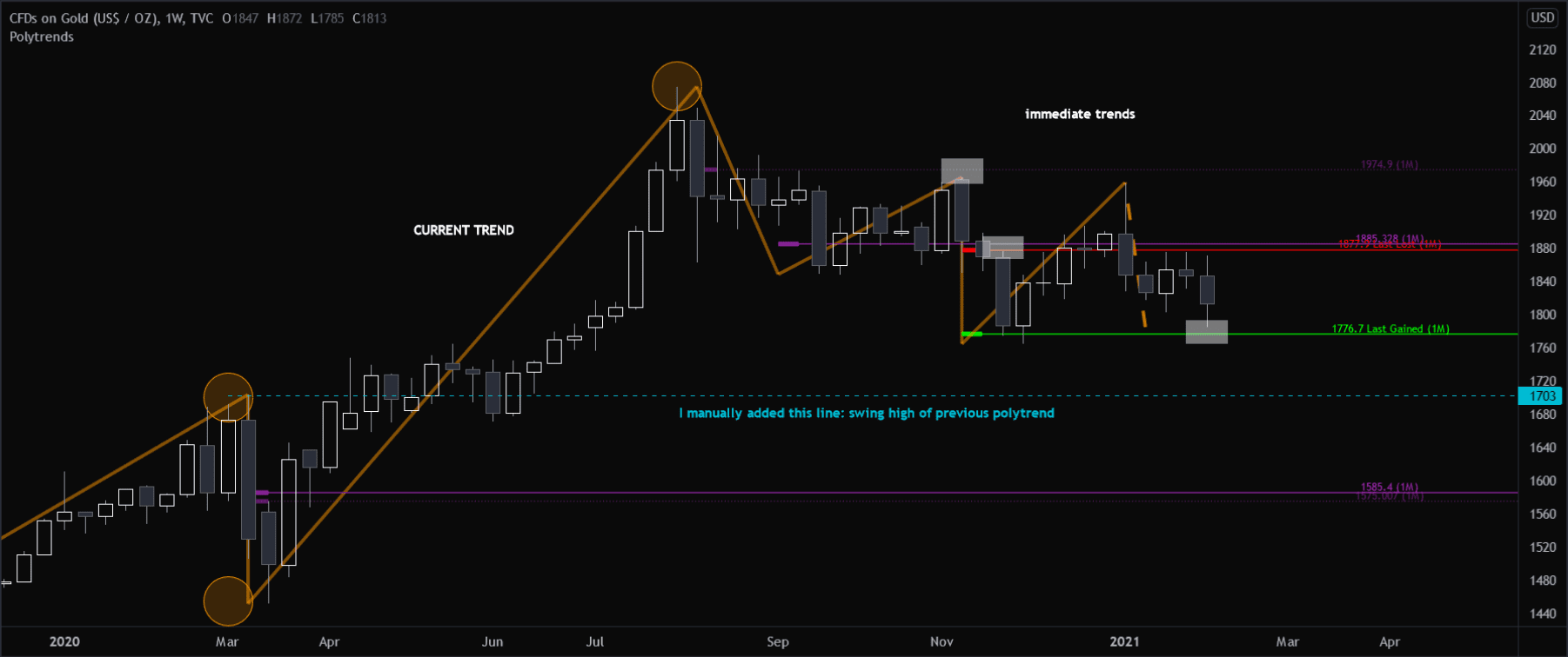
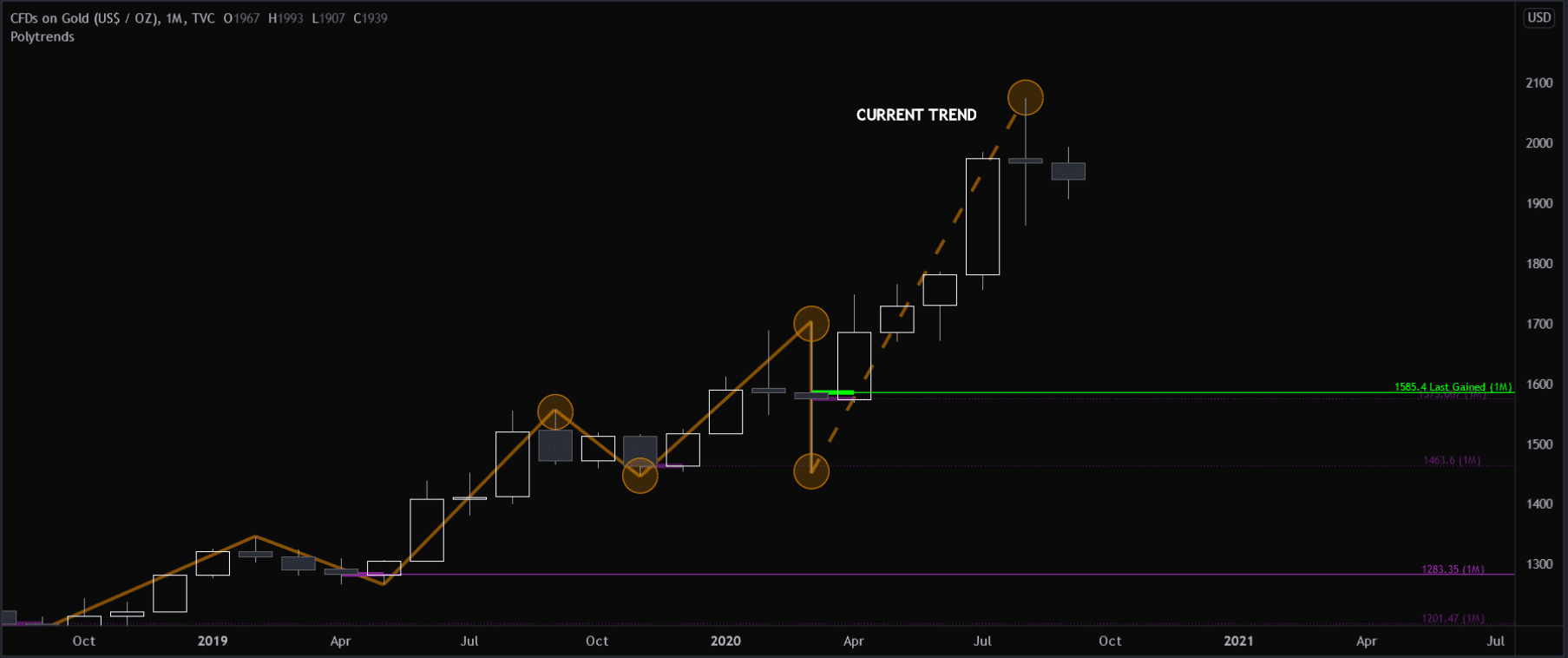
Here’s an illustration on a monthly GOLD chart:
I’ve changed the color settings a bit to help with these illustrations, and I’ve added a few labels.
The dotted orange line represents the current trend of relevance (which Polytrends tracks for you).
The circles, I’ve added, to help you visualize each separate and previous trends that were tracked and plotted. It’s important to note: the swing high and swing lows of each polytrend can and will often act as significant levels on higher time frames like the monthly and weekly charts; however the Algo will not plot those levels for you.
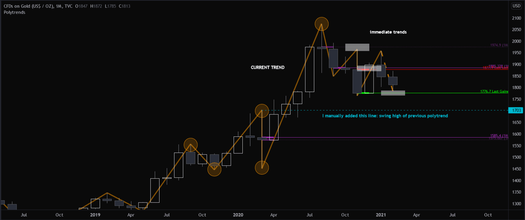
If we fast forward in time, we can follow the progression of GOLD’s price movement, and understand how Polytrends was tracking each trend/level.
Things to note:
- white boxes = illustrates Polytrends’ levels being tested and respected
- manually added blue dotted line = previous swing high of monthly polytrend.
As you can see below, I’ve fast-forwarded in time. Polytrends then drew out the immediate trends and their corresponding levels of support and resistance. I’ve added the white boxes to help illustrate where each level was tested/respected, which could either have been a trade entry and/or a potential trade exit (profit target) depending on your trading style.
Simplified Trends Within
Tracking trend can be a complex task, especially when you see how many trends are being plotted by the Algo. Technically each polytrend could, in theory, become a potential trade. It’s also worth pointing out that to truly master trend, you should also be aware of the bigger trends that polytrends doesn’t always track, but are also a trend within a trends.
You may have already noticed the large trend structures that I’ve highlighted for you in blue. Notice how each orange polytrend is plotted illustrating each individual trend, but is also comprised of a bigger trend within. This is the actual fractal nature of markets of which I have observed, unlike other definitions that others may have conjured up in their imaginations.
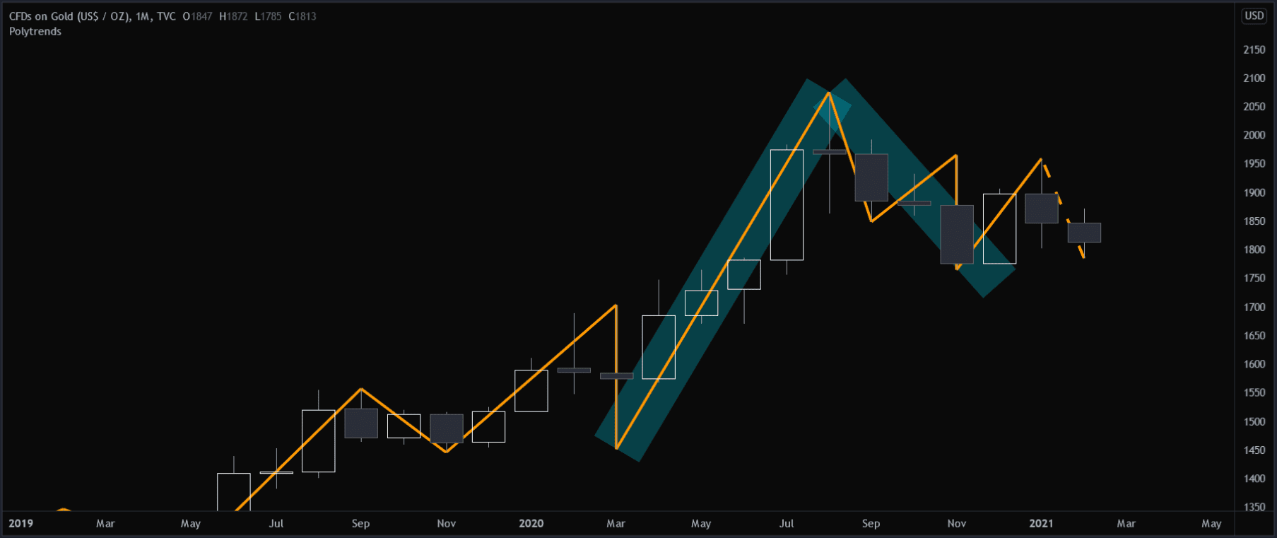
Lower time frame = more detail.
If this still seems confusing, we can get more detail by rotating down one time frame lower: the weekly chart.
I’ve changed no settings or illustrations. We’ve simply just reduced the chart time frame to see more detail. It now becomes more clear — the white boxes more clearly illustrate how the monthly levels were tested/respected.