My Chart Looks Messy, What Do I Do?
Sometimes you will load your chart and it will be scrunched together, making it difficult to read. This sometimes happens for two reasons:
- When the price is creating new trends within close proximity of one another (areas of consolidation/congestion.)
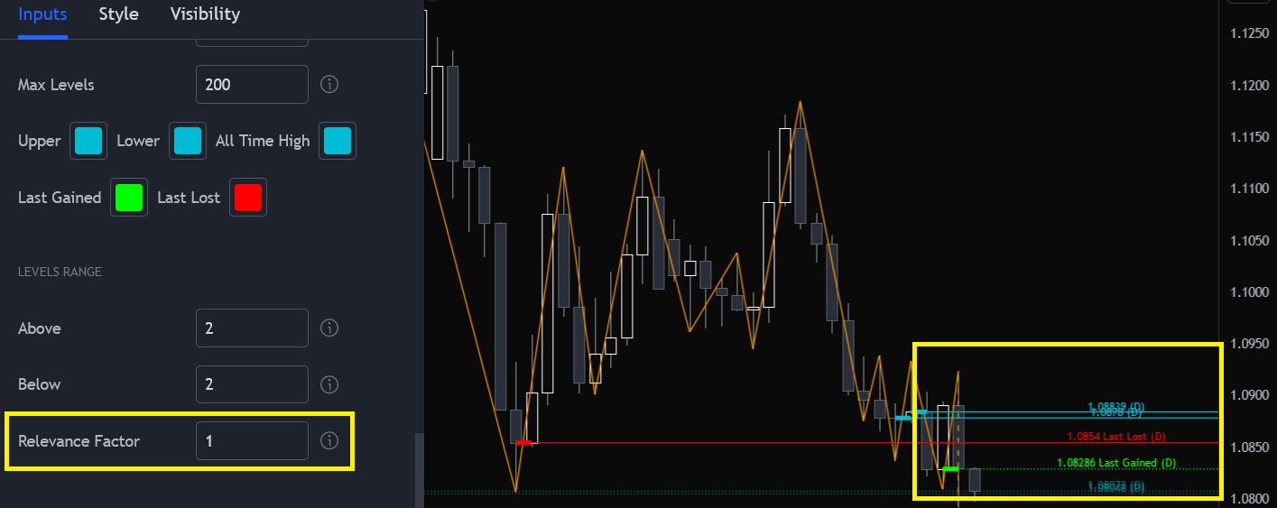
- Relevance Factor is set too high.
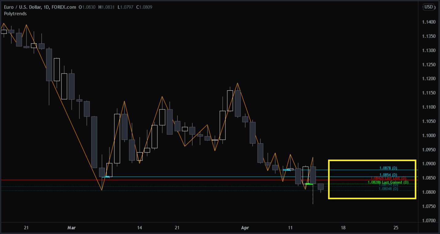
Notice the yellow box on the chart below and how close together the levels are plotted.
How we can fix it:
We can fix this by attempting to reduce the Relevance Factor. This will cause the algo to only look at trends to the right of the chart, reducing the number of possible levels that it could track.
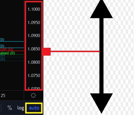
We can also uncheck the ‘auto’ setting at the bottom right of our chart, and then manually resize our charts by draging the price bar up or down and/or mouse-wheel scrolling while hovering over and inside the chart.